Hi,
My name is Connor Hines. During my four years in high school I took Art 1-3, DigiPhoto 1 & 2, and Journalism 4 (Yearbook). The first 5 of these courses fulfill the Visual Art Elective Pathway Concentration.
Entranced - Charcoal - 18" x 24" - 2024
Art 1
Still Life - Graphite - 2021
The assignment was to create a 3 object still life, consisting of a glass bottle, a metal object, and an organic object. I improved my observational drawing skills and handling of graphite.
A Rubber Duck and its Carrier - Pen and Ink - 2021
The project was to create an ink drawing two objects with sizes reversed. I drew a massive rubber ducky floating in front of a containership. I learned how to stipple and refined my crosshatching. I also used dip pens and India ink for the first time.
Worlds Reversed - Procreate - Digital Art - 2021
In this digital piece I learned how to use Procreate to make a drawing about a season.
International Fire-hydrant Observatory - Watercolor - 2021
The assignment was to create a "building" of something that normally isn't a building. I grew my creativity in the idea development for this painting and strengthened my use of watercolor. I also learned how to create a dark red with watercolor. This was one of my favorite projects in Art 1.
Owl - Graphite - 2022
This project was a grid drawing. I learned the importance of having a full range of value. I wish I had created depth by using the full grayscale everywhere, not just in the eyes.
Into the Sea - Watercolor - 2022
This watercolor was my final project in Art 1. I learned how to paint ice and water for the first time. This is a study of penguins jumping into the water. I was inspired by the art of David McEown and a desire to visit Antarctica.
DigiPhoto 1
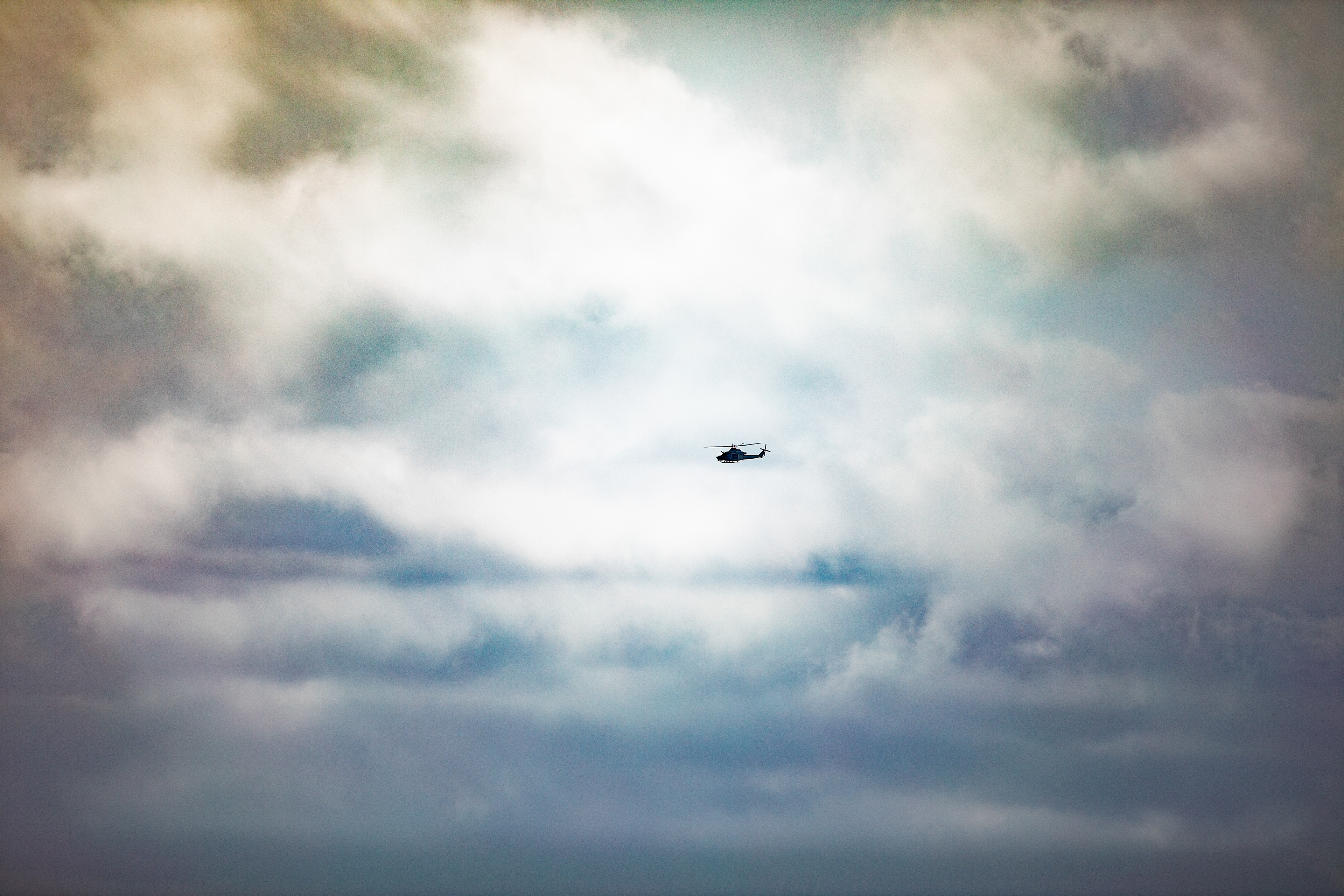
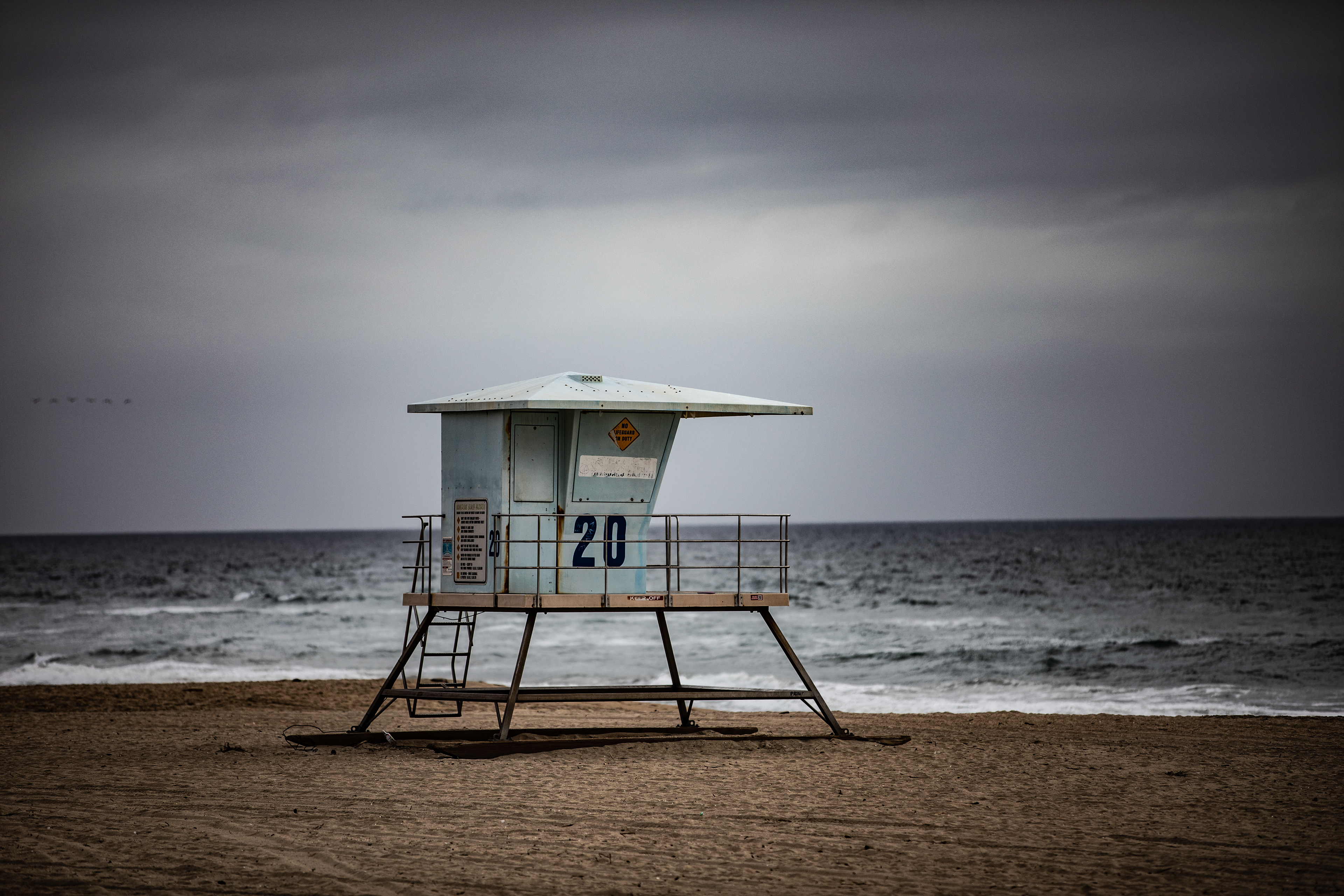
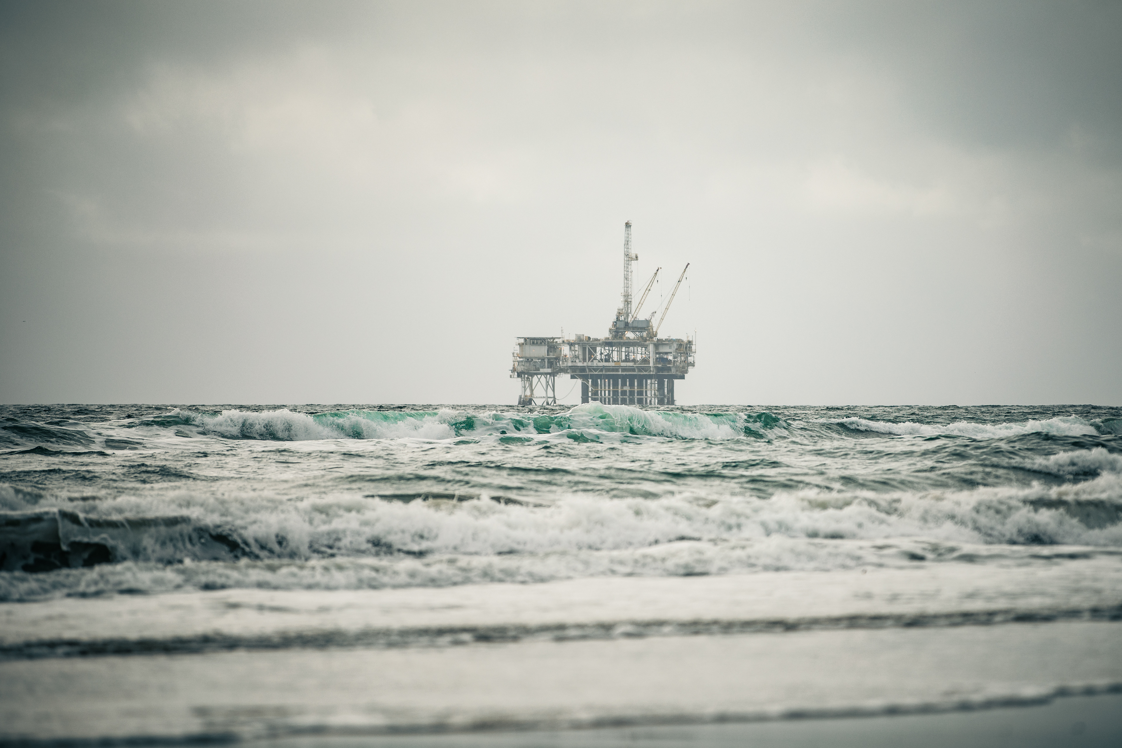
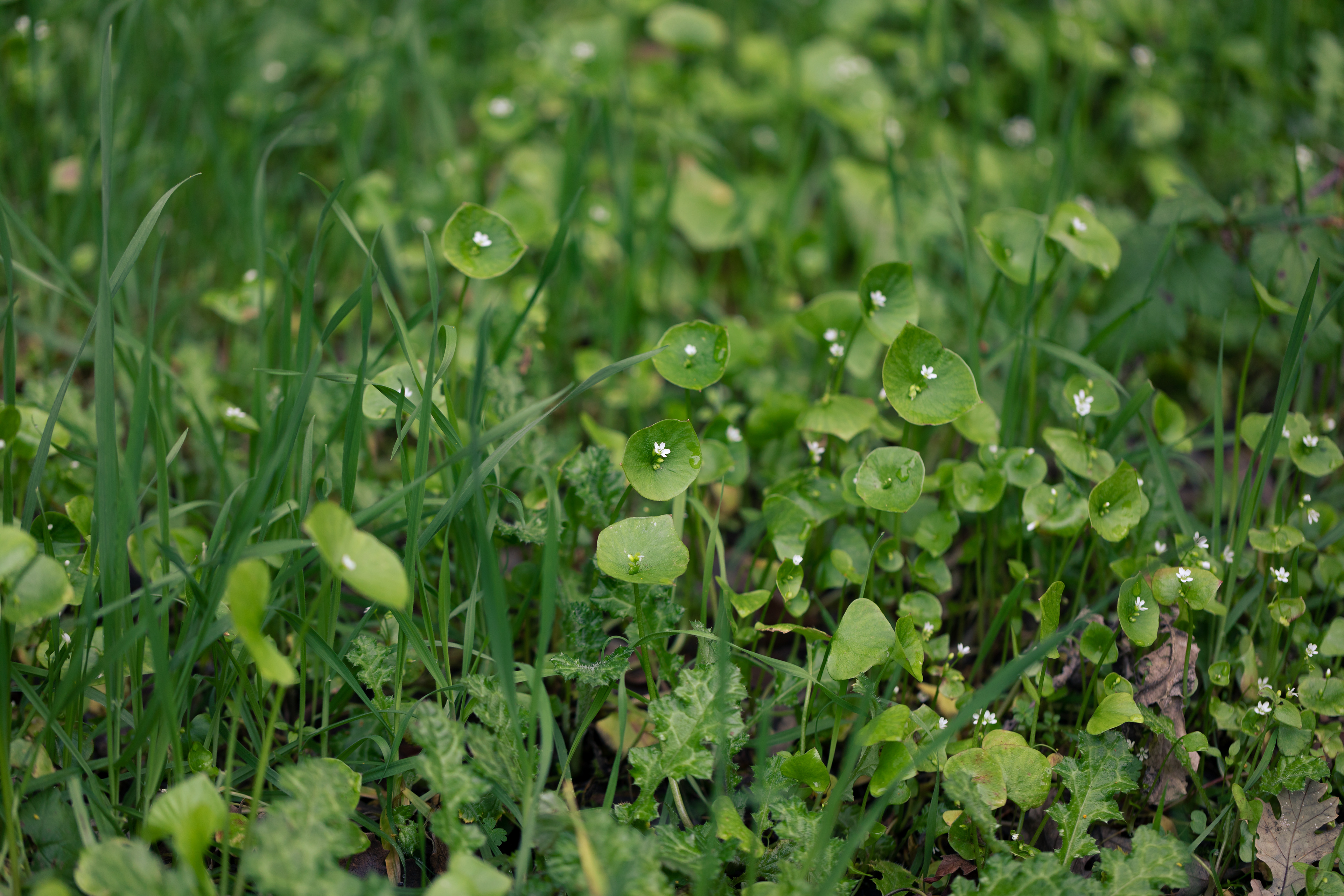
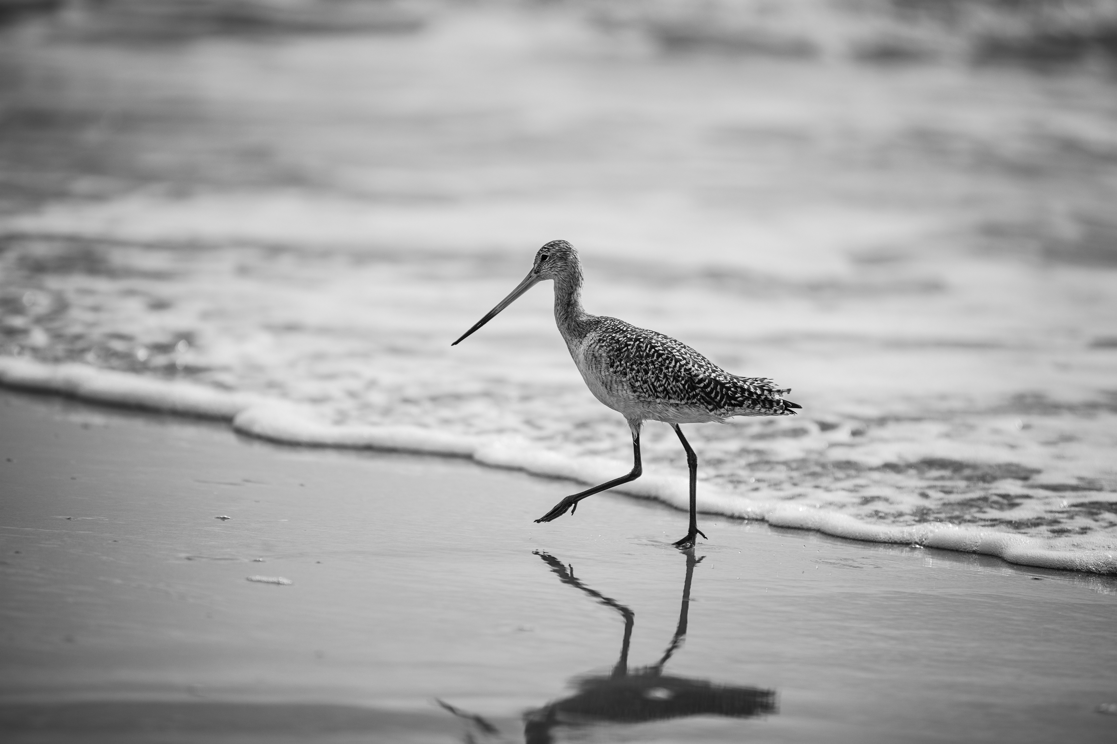
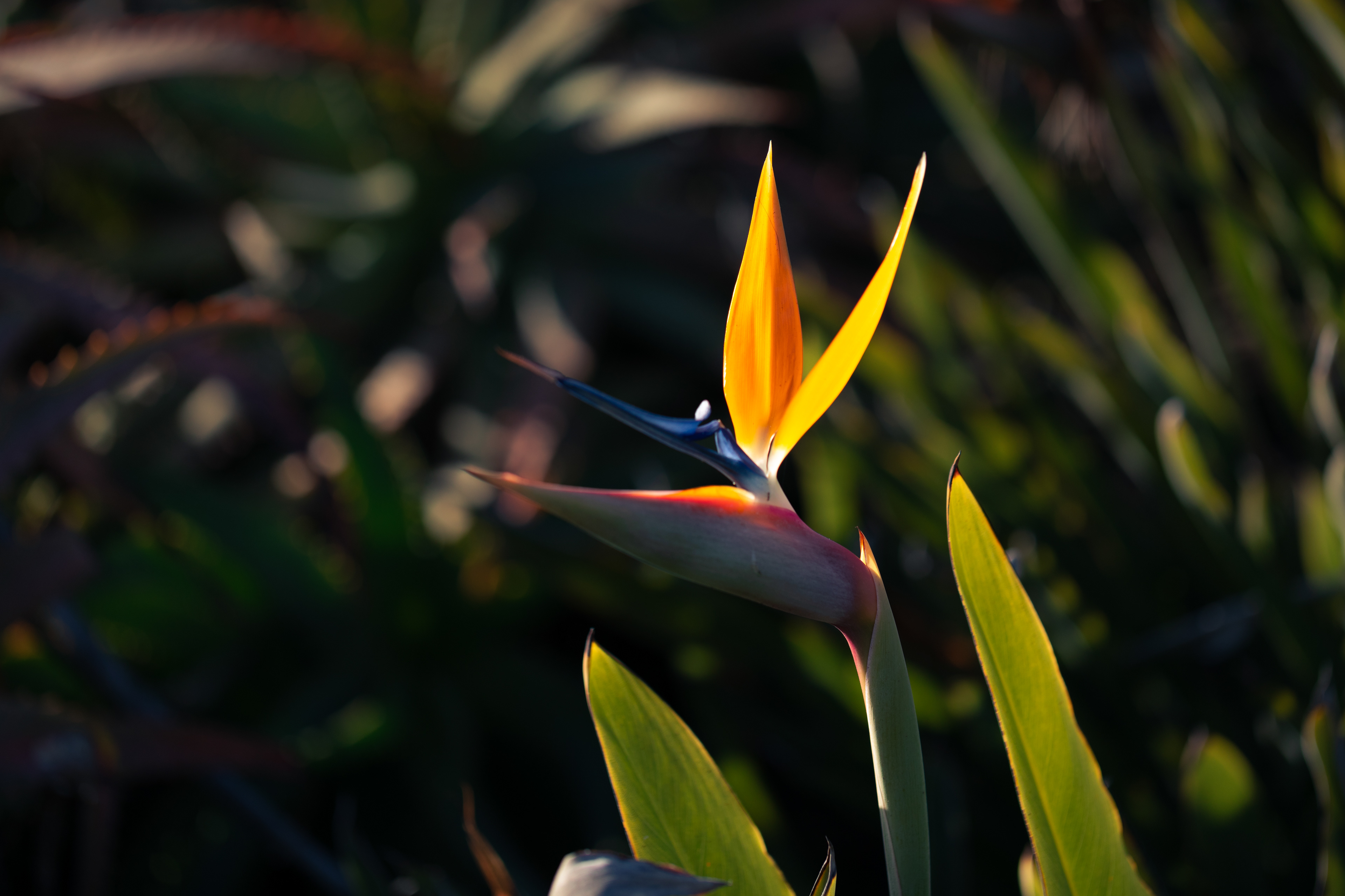
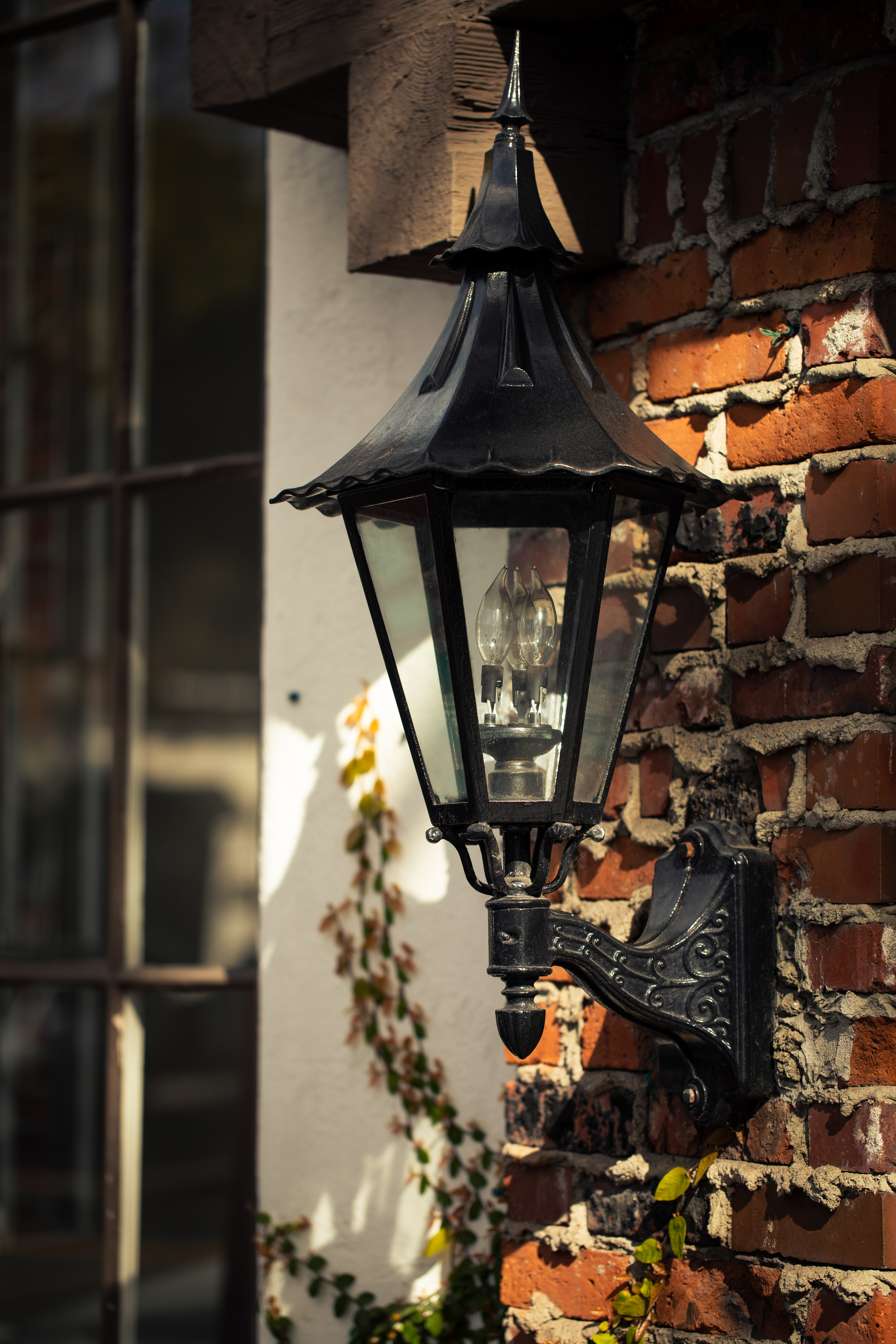
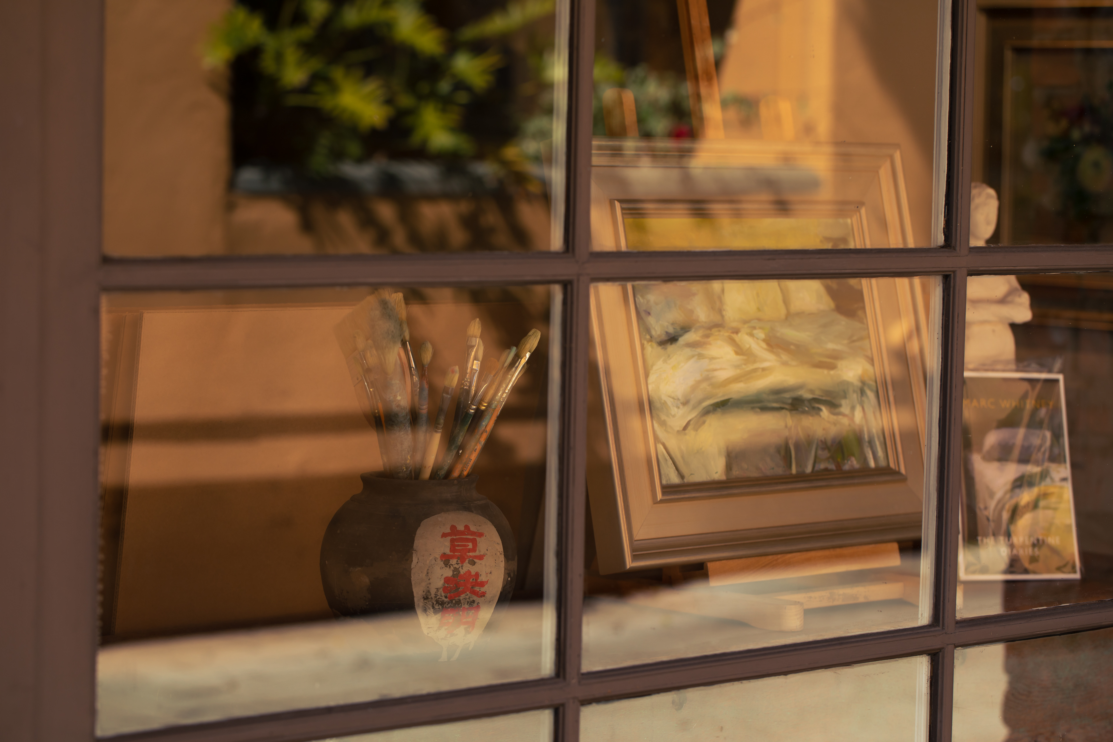
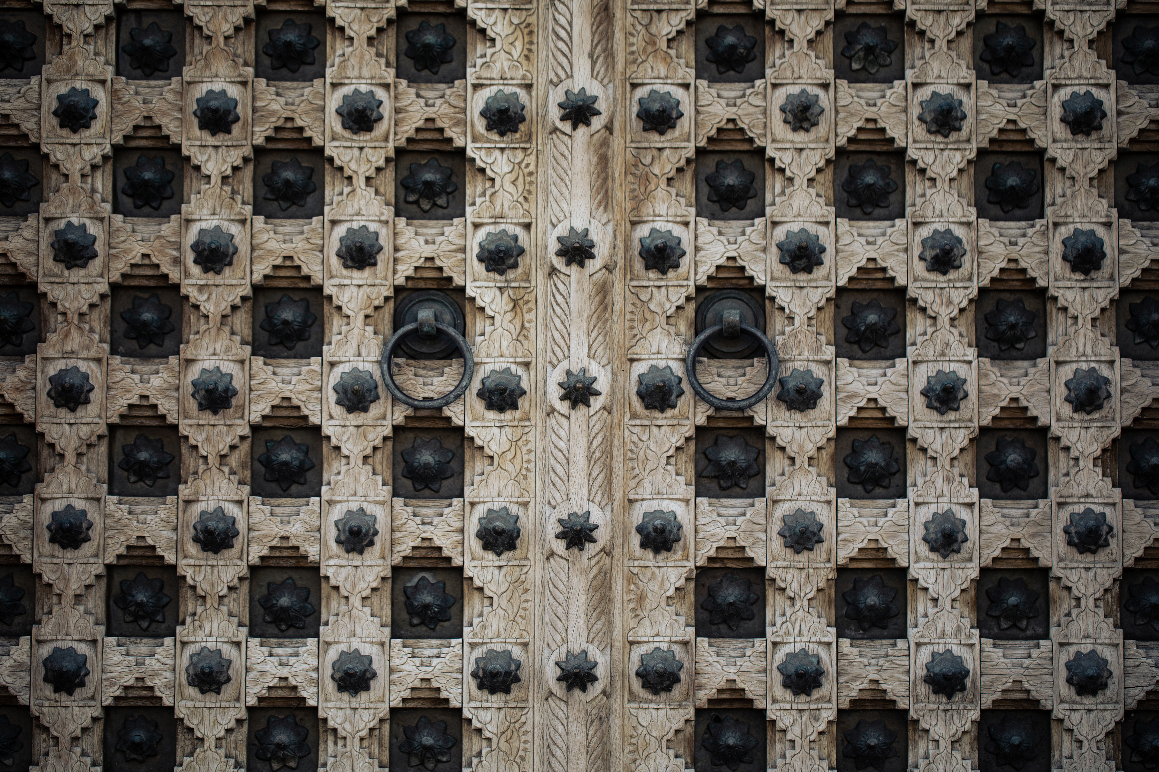
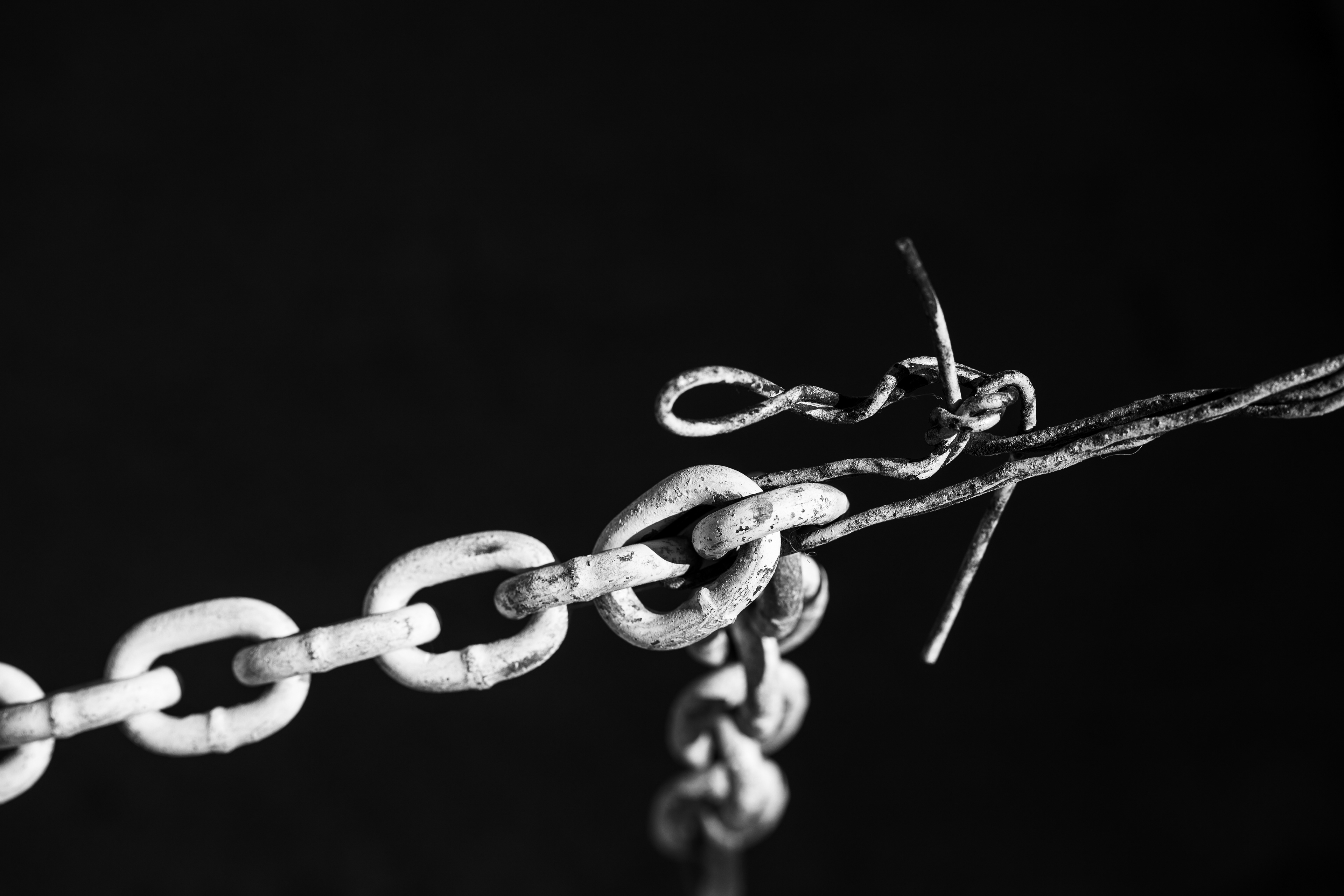
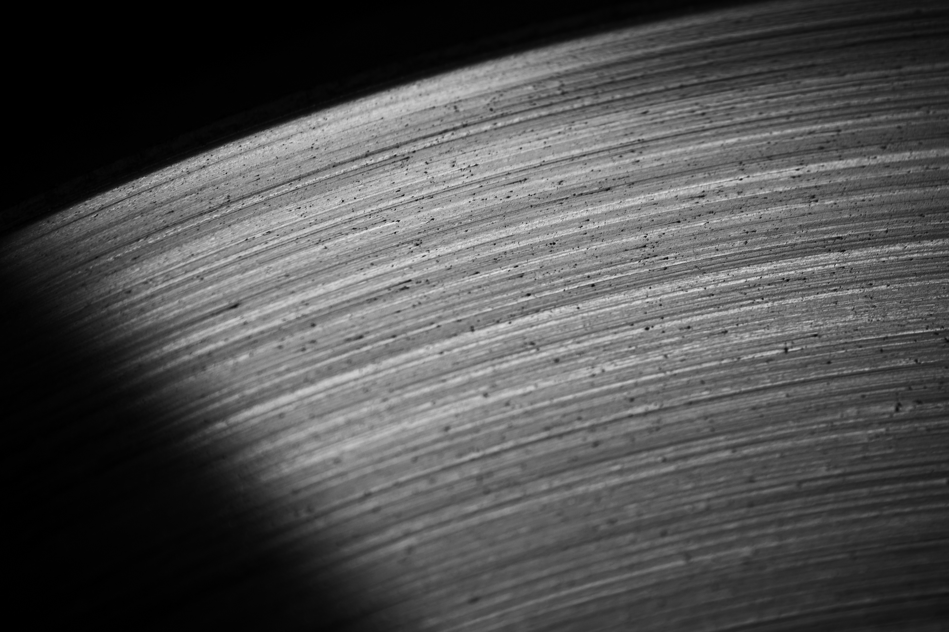
The project was to create a series depicting the elements of art and principles of design. While creating this 10-piece set, I improved my macro photography, creative editing, and sequencing.
San Clemente
Exploring, black-and-white photography, I captured the rays of light after a rain storm. I took this photo on the way to San Diego, California, right before sunset.
Sedona
I took this landscape with a wide angle lens. I learned how to replace subtle elements using Photoshop. Look carefully at the moon; it's not actually the real moon of the photo. The original moon was a white smushed blob from over exposure and lens distortion. I replaced the moon with an image I had previously taken and color matched it for the photo.
During the black-and-white photography unit, I learned to look for high contrast and interesting textures for my subjects. I took this photograph at a classic car show in Laguna Beach. We stumbled upon the show on our way to lunch to celebrate my 16th birthday. This unit was one of my favorites in DigiPhoto 1.
This image was created for the same project as the prior one. While trying to photograph these fighter jets, I quickly realized auto focus was too slow. I manually focused to where I thought the planes would be and panned with them as they flew by.
This project was to create a Photoshop composite image. I started with a landscape and removed the sky. I added crumpled paper to symbolize the piece being a memory. I used a self portrait, a camera lens and a cow to commemorate my trip to the Dolomites. I placed flowers in the cow's ears to add humor.
DigiPhoto 2/Yearbook
I worked with my team to create this art spread. We took photos in different art classes, interviewed students, and painted a background using watercolor and salt.
This Procreate drawing was for the '24 yearbook merch. I relearned Procreate for this piece.
This graphic is one of 26 index letters from the '24 yearbook. Creating these I learned how to use the Photoshop pen tool and 3rd party scripts.
Art 2
The Man in the Moon - Color Pencils, Ink, and Chalk Pastels - 2023
The project was an exquisite corpse drawing as a class. I started with a blind contour self portrait and drew the moon referencing the man in the moon.
City of Penguins - Watercolor and Ink - 2023
The project was to create a one point perspective drawing. I challenged myself by making a three point perspective drawing of Wall Street with penguins replacing the traditional men in suits.
Atlas - Colored Pencils on Blue Matte Board - 2023
The assignment was to draw a cupcake and a figure so I merged the two. I learned how to draw on matte board and use colored pencils to create a realistic drawing.
Garrapata Through The Years - Photograph and Acrylic Paint - 2024
I created this mixed media piece for NUMU and it was selected to be displayed in their gallery exhibition. I began with a photograph, I took of Big Sur printed on canvas.. I then used acrylic paint on top of the right two thirds, resulting in this finished piece.
Progress - Oil Paint and Wood-burning on a Wood Panel - 2024
I began by wood-burning my sketch on the panel. I then painted the mountains and stained the foreground with oil paint. Finally, I wood-burned the bison. I learned how difficult skeletons are to draw.
Yearbook 2
Write-ups for this section are not included since it is not technically part of the Visual Art EPC.
Art 3
This is a preliminary sketchbook spread for a couple of ideas related to human impact on our environment. I developed the idea on the left side into a finished piece titled “A Legacy.” I sketched a layout for the piece and a thumbnail of the self-portrait. I also showed how collage elements will be the background for the piece.
A Legacy - Mixed Media - 2024
I learned how to screen print for this project.
I created this piece to show today’s damaged environment. Using historical National Geographic articles and current El Gato clippings from my school’s newspaper, I portray different aspects of environmental degradation. To form the background, I arranged photos, articles, and poems on the wood panel. Inspired by Andy Warhol’s screen prints of Marilyn Monroe, I made four silk screen self-portraits. To highlight certain collage elements, I used brads and a string to direct the viewer. These points tell a story beginning with an Emperor penguin, an animal at risk from climate change, and ending with the “universe of pollution” the world faces. I use four colors to convey four emotions in the prints: red is anger, blue is sadness, orange is determination, and green is hope. Living in this “Legacy,” I am passionate about helping save the environment.
This is a Photoshop composite I created as part of showing my process for my AP inquiry. The final painting will be a veristic surrealist oil painting on a 24" x 24" canvas.
Comparison
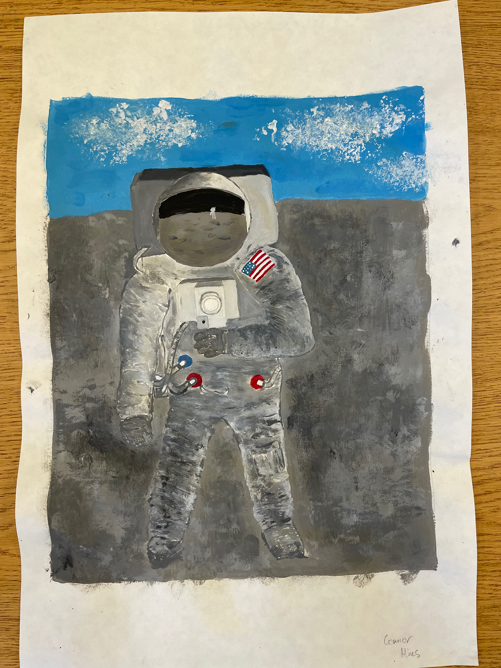
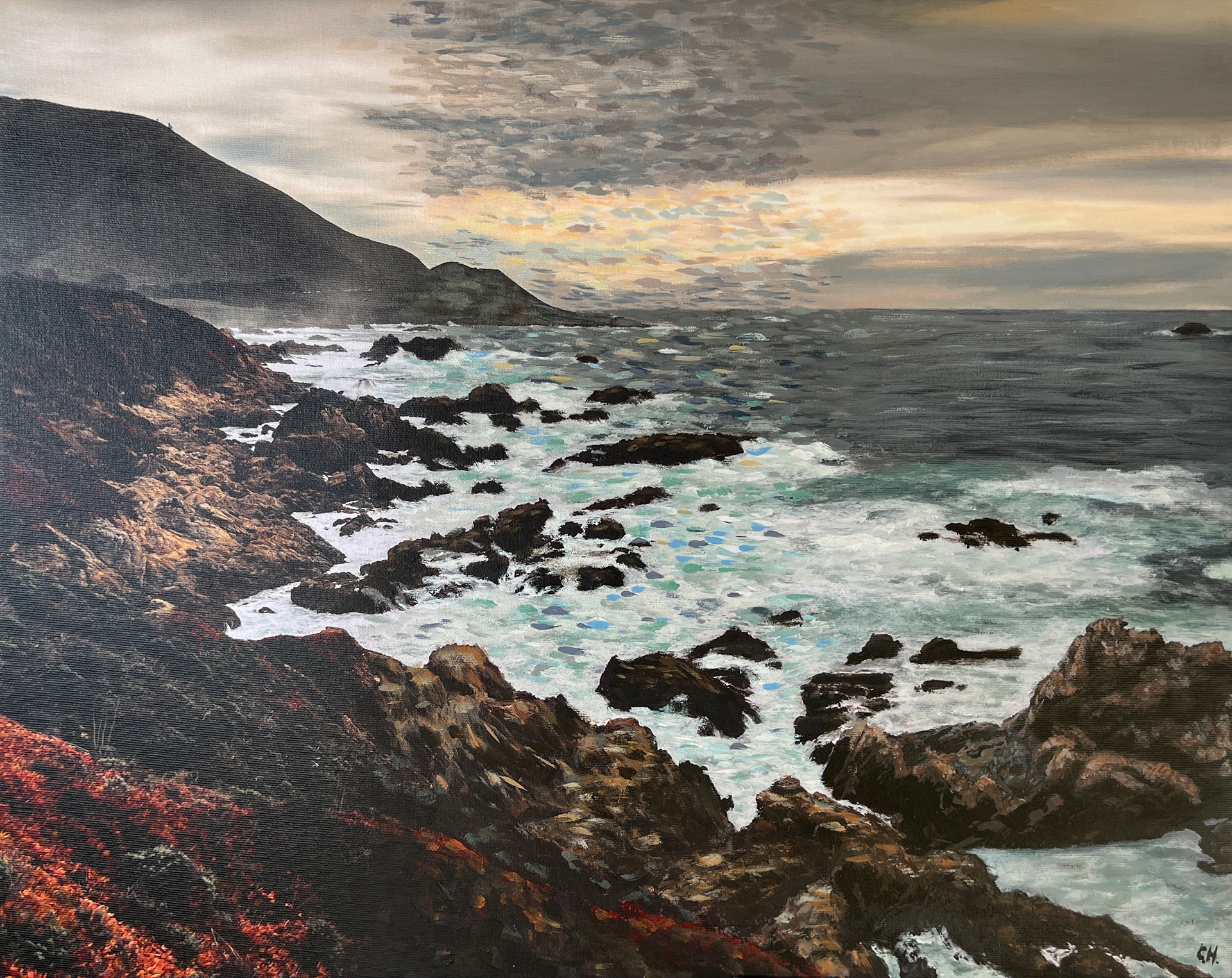
These are two acrylic paintings I created during my time in art. The astronaut on the left was painted as a freshman in Art 1 while the landscape on the right was painted as a junior in Art 3. I greatly improved my handling of acrylic paint and idea development.
Conclusion
Through my art classes at LGHS, I furthered my creative and technical abilities. I learned many new skills: Photoshop, Illustrator, Procreate, Lightroom, screen printing, pen-and-ink, wood-burning, and traditional layered oil painting. I am grateful for the guidance and support I received from Mr. Smith in Art 1, Mr. Yanowsky in Art 2 & 3, and Ms. Christie in DigiPhoto 1 & 2 and Yearbook. Unfortunately, I did not have the time to take Graphic Design and Ceramics. All my courses have strengthened my understanding of design and furthered my passion for the arts.